Skip main navigation

Yes! I’m open and accepting
new work.

Presentations

Going deep on specialist topics.

Client

Reflexions

Timeline

2020–2023

Role

Research, Design, Presenter

At Reflexions, I was given a number of opportunities to do some research on interesting topics and present back to a larger (or sometimes, smaller) group. As head of the design department I instituted semi-regular presentation schedule as a tactic to allow us all to go through the process of researching a topic, documenting our research, and gain comfort in presenting that work to a small, low-stakes group. This continued as our team makeup evolved.


Design, Accessibility, & Inclusion

  • Accessibility title slide - Design Accessibility & Inclusion: What We Do Now and What Comes Next. Slide is stylized to show color contrast information for two color schemes, one meeting WCAG contrast ratios and one failing to meet them.
  • Slide reads ACCESSIBILITY in all caps and animates between showing a question mark and not showing a question mark
  • Slide text: What do we mean by accessibility? Affordances built into systems to allow as many people as possible to access those systems as they wish.
  • Slide text: What do we mean by accessibility? Almost everyone, at some point, is going to have short- or long-term changes to their range of sensory experience or ability to respond to interactive systems.
  • Slide text: What do we mean by accessibility? “Disability” is not a static category, and does not reflect or fully map to the full range of experience accessible design is meant to address.
  • Animation showing several slides illustrating some common scenarios that may result in a person benefiting from accessibility measures. Includes: Illness, Injury, Pets, Kids, Environmental Factors, Aging. Each slide includes a stylzed photograph in the background illustrating that scenario.
  • Slide text: Typogaphic legibility: Font selection. Illustrated with some typographic of varying legibility as text and an indication of which would likely be considered accessible.
  • Slide text: Use of Color: Color cannot be the only method to convey information. Illustrated by a sequence of red shapes getting increasinly detailed, starting with a simple red square and ending with a red caution icon and the word
  • Slide text: Use of Color. Test colors for differentiability for users with color- blindness. Includes list of suggested software. Illustrated with photo of Oscar the Grouch (green muppet) and Elmo (red muppet) with various visible simulation modes laid over them.
  • Slide text: Let's Discuss. Join is in the #accessibolity Slack channel.

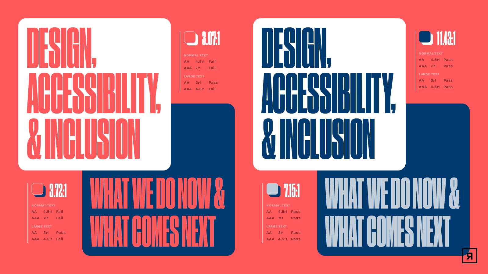
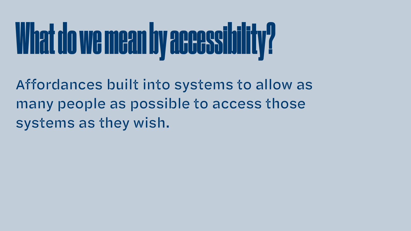
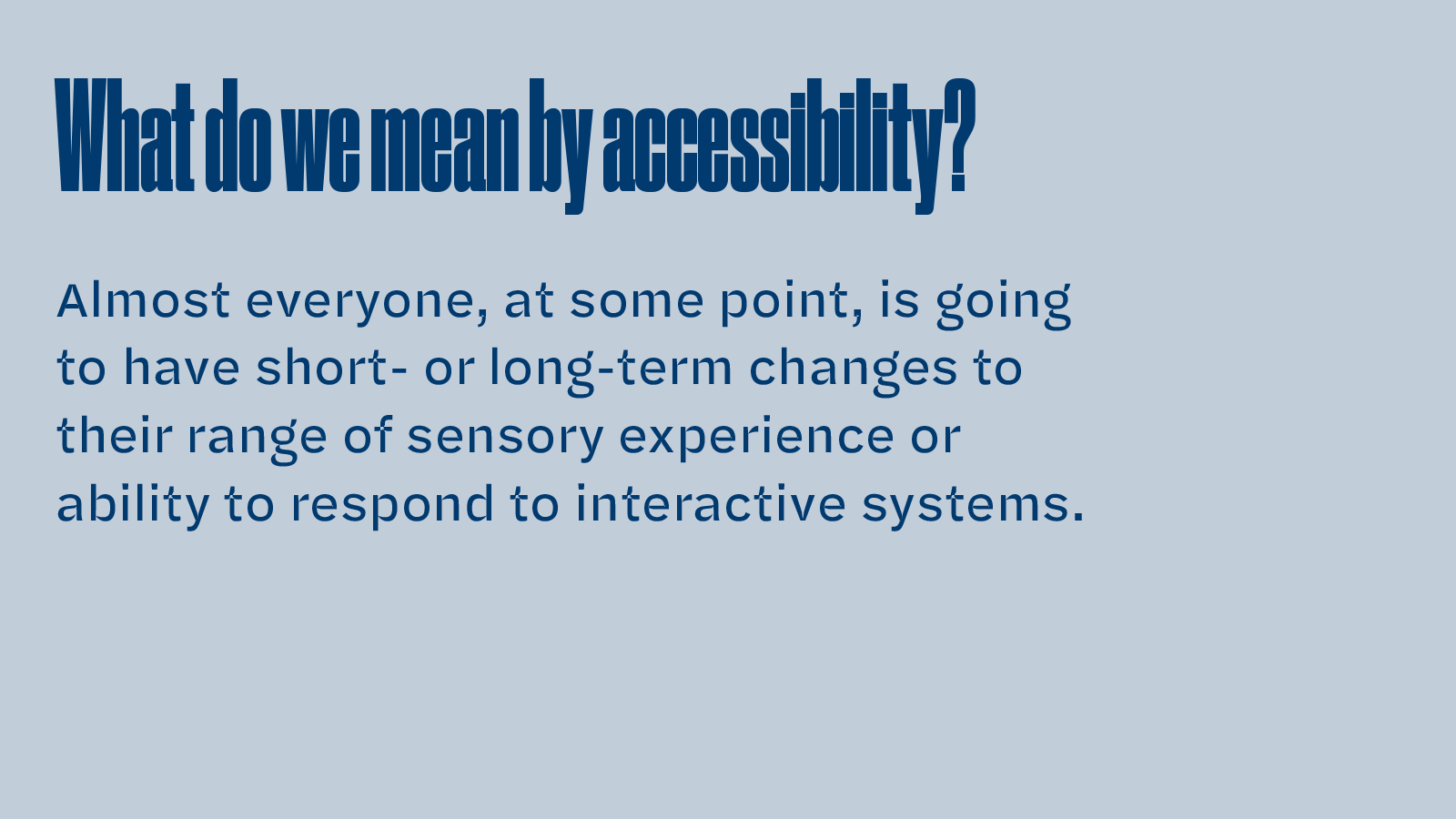
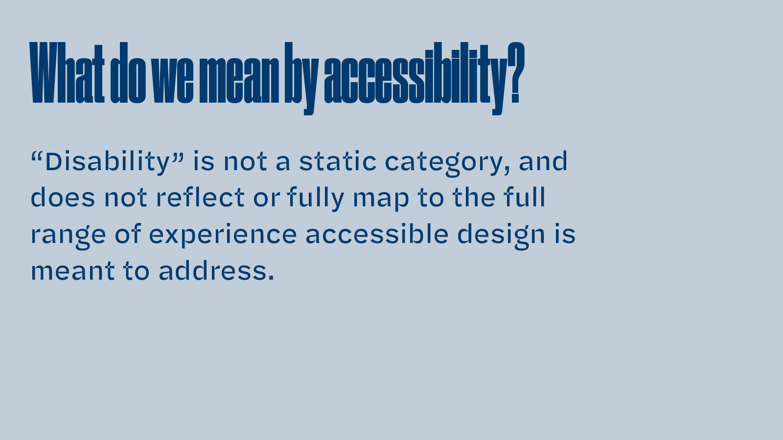
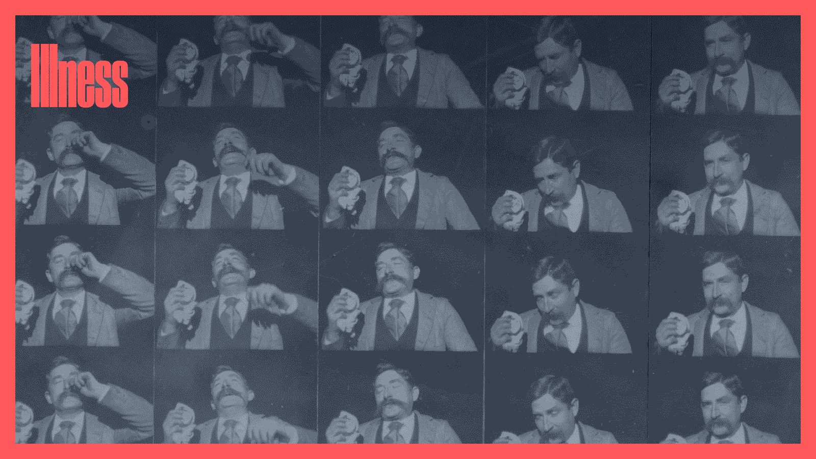
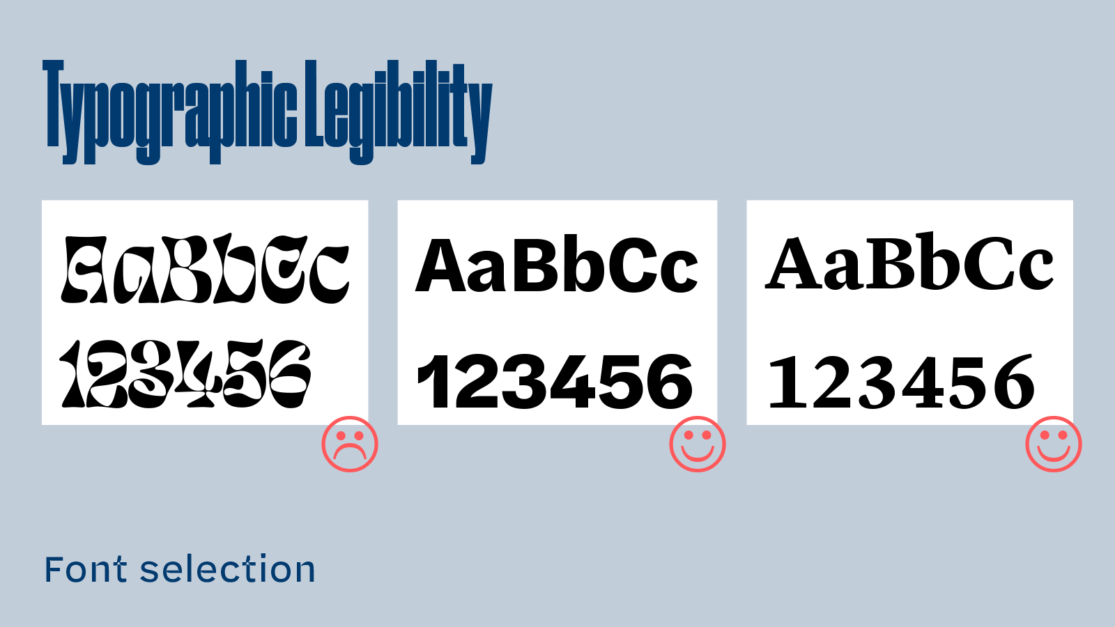
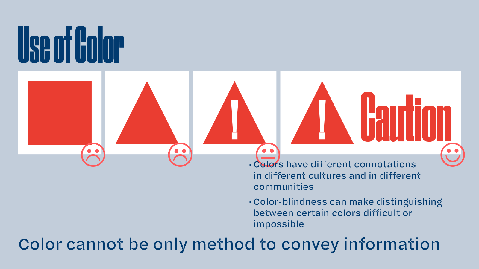
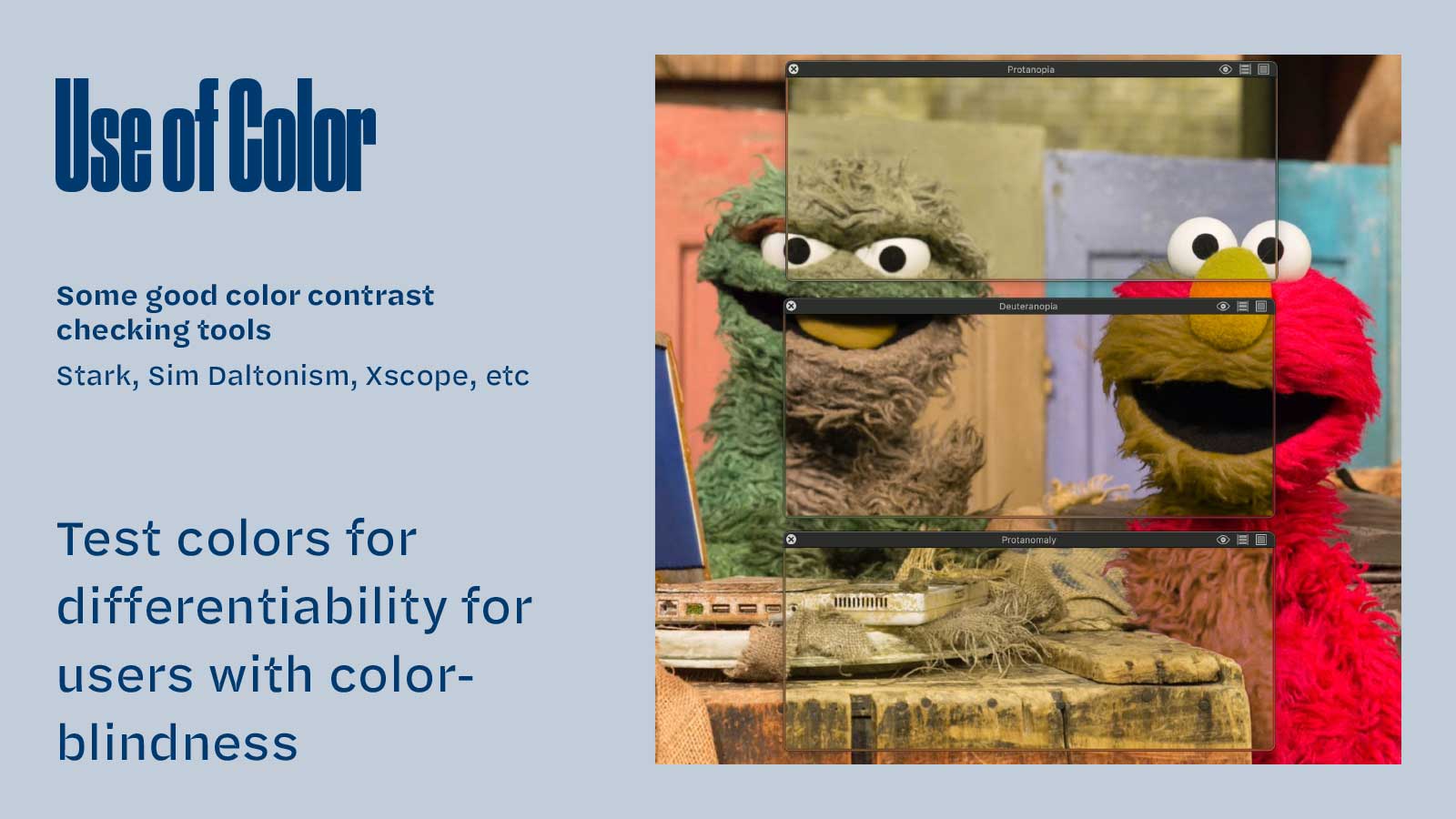
I was invited to give a presentation on the topic of Accessibility to the Reflexions staff at our first company retreat after going fully remote due to COVID-19. As a web design and development agency, accessibility was a core tenet of our work but is also always a work in progress. This presentation took an inclusive approach to the topic, acknowledging that accessibility is a civil right, goes beyond industry standard best practices, is a moving target as systems improve, and is a philosophy that intends to aid all users of systems we design and develop.


The Care and Feeding of Variable Fonts

  • Title slide text: The Care and Feeding of Variable Fonts
  • Slide text: What Are Variable Fonts? Variable fonts are a feature within the OpenType format to allow for arbitrary values of a typeface—typically weight, width, and angle—to be derived from a single font file via end-user manipulation of axis values. They rely on software’s ability to interpolate between defined values.
  • Slide text: What Are Variable Fonts? Wait, what's an Axis? Slide explains and illustrates what an axis is in the context of variable fonts. Slide is animated to show body text increasing in weight corresponding to points along it's weight axis.
  • Slide text: What Are Variable Fonts? Wait, what's interpolation? Slide explains concept of interpolation and illustrates an arbitrary value (623) between preset weight values (500 and 700).
  • Slide text: Where did Variable Fonts Come From? Slide illustrates some notable samples from type history of the origins of what we think of as default characteristics of a font (roman, italic, bold) and discusses that these have not always been used.
  • Slide text: Where did Variable Fonts Come From?  Slide discusses concept of variation within a font having a historical basis, illustrated with a Noordzij cube
  • Slide text: Digital Font Formats. A digression on roughly 35 years of software development. Slide is part of an overall timeline showing the progression from true-type fonts to open type fonts. This slide discusses Adobe Type Manager, special software which permitted interpolation of PostScript (bitmap) font files to intermediate sizes introduced in 1989.
  • Slide text: Digital Font Formats. A digression on roughly 35 years of software development. Slide is part of an overall timeline showing the progression from true-type fonts to open type fonts. This slide browser support for variable fonts via CSS rendering and animation in 2020.
  • Slide text: Multiple Masters. A second-level digression. This slide discusses the implementation of so-called Multiple Master fonts by Adobe which were a notorious failure.
  • Slide text: Some notable examples. This slide shows six illustrative variable fonts with range of what their viarable axes are intended to allow interpolation of.

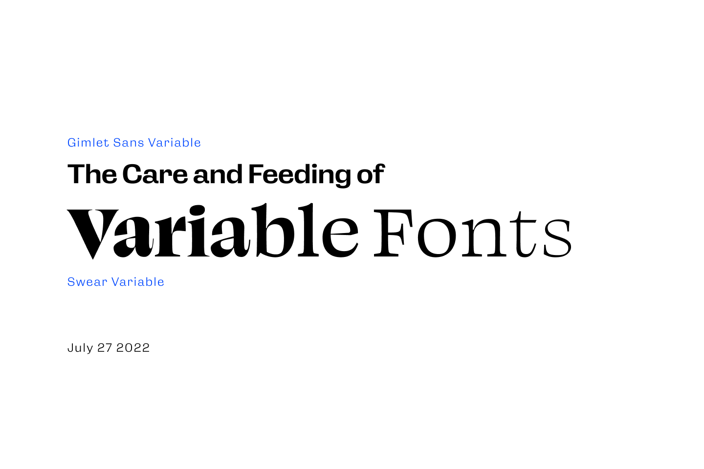
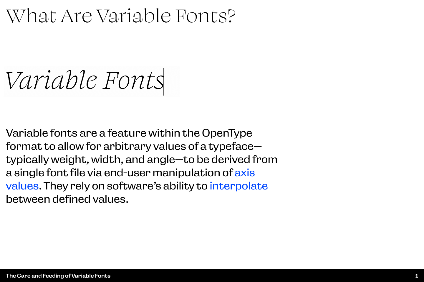
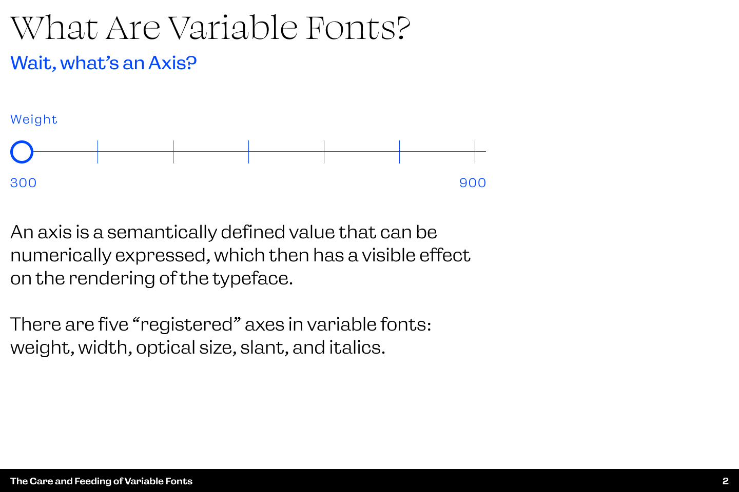
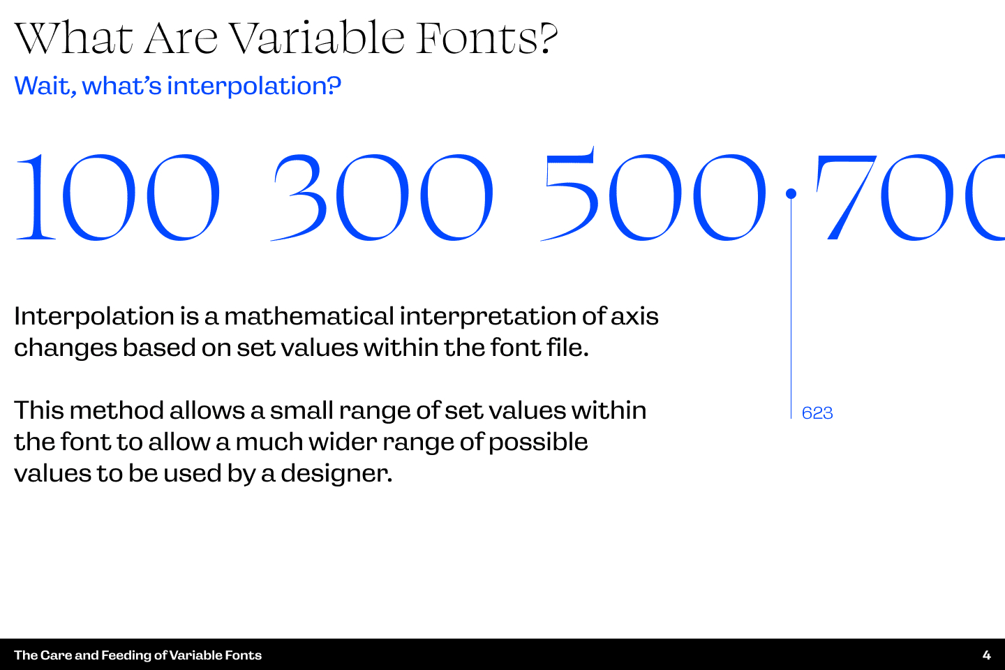
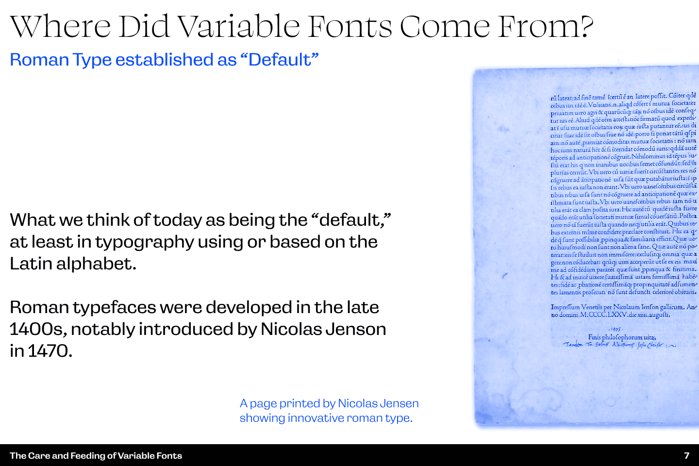
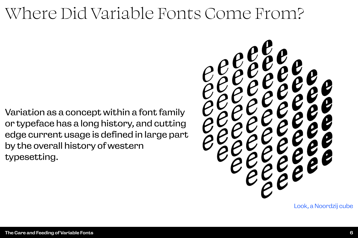
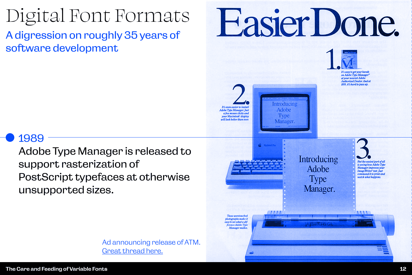
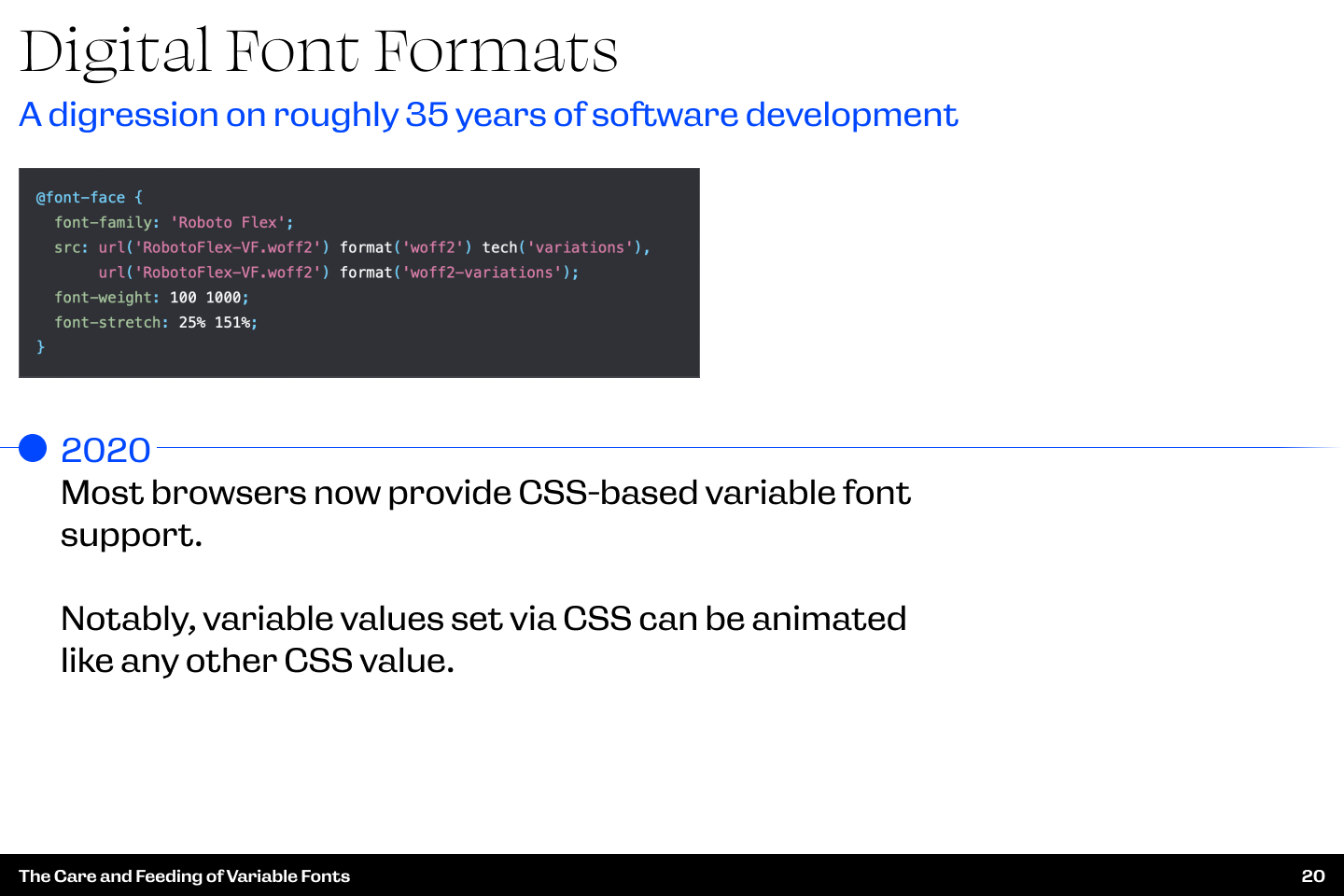
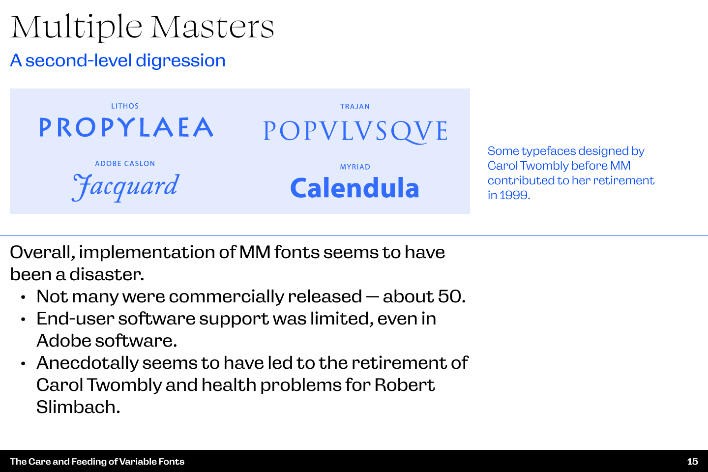
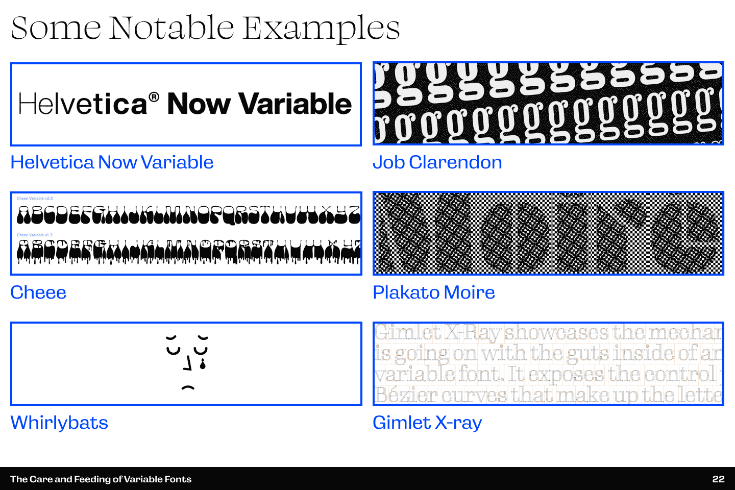
This presentation was given as part of a series of presentations internal to Reflexions' design team. In it, I took the opportunity to do a deep dive on the history and implementation of variable fonts, and discussed the technological concepts used to implement them as well as the historic concepts which preceded their development.


Hello Dark Mode My Old Friend

  • Title slide text: Hello Dark Mode My Old Friend. Animates between a simulated light mode and dark mode for the slide.
  • Slide text: Users of these technologies may have preferences, but little opportunity to define their preferences. Illustrated with early software GUIs ranging from light text against a dark background in a terminal interface to early examples of light backgrounds for software intended to emulate writing or drawing on paper.
  • Slide text: “Dark mode” arises from specialist user preference and access is broadened by technical necessity. Illustrated with early examples of software interfaces with color schemes which can be customized based on user preference.
  • Slide text: Usability and accessibility. Slide discussing the physical effects of darker vs lighter stimuli on the human eye and potential for lighter stimuli to lead to fatigue or decreased focus. Slide acknowledges lack of scientific study.
  • Slide text: Dark Mode is an Expression of User Preference. Animates between a simulated light mode and dark mode for the slide.
  • Slide text: Best Practices/Considerations. Slide outlines some basic best practices and suggests that providing a dark or light mode is not simply a matter of inverting the existing color scheme. Illustrated with a screencap of Reddit's web interface switching between modes.
  • Slide text: Design System convention. Slide discusses Figma approaches to programatizing color schemes via modes within files. Slide animates between a dark and light mode.
  • Slide text: Children of Darkness. Expands discussion of possible use of modes in Figma to allow for other approaches to expressions of user preference.

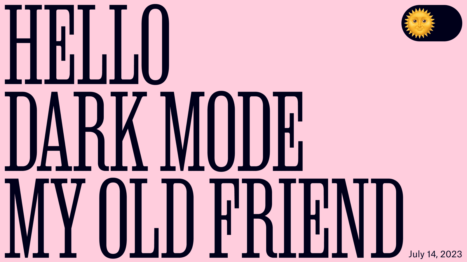
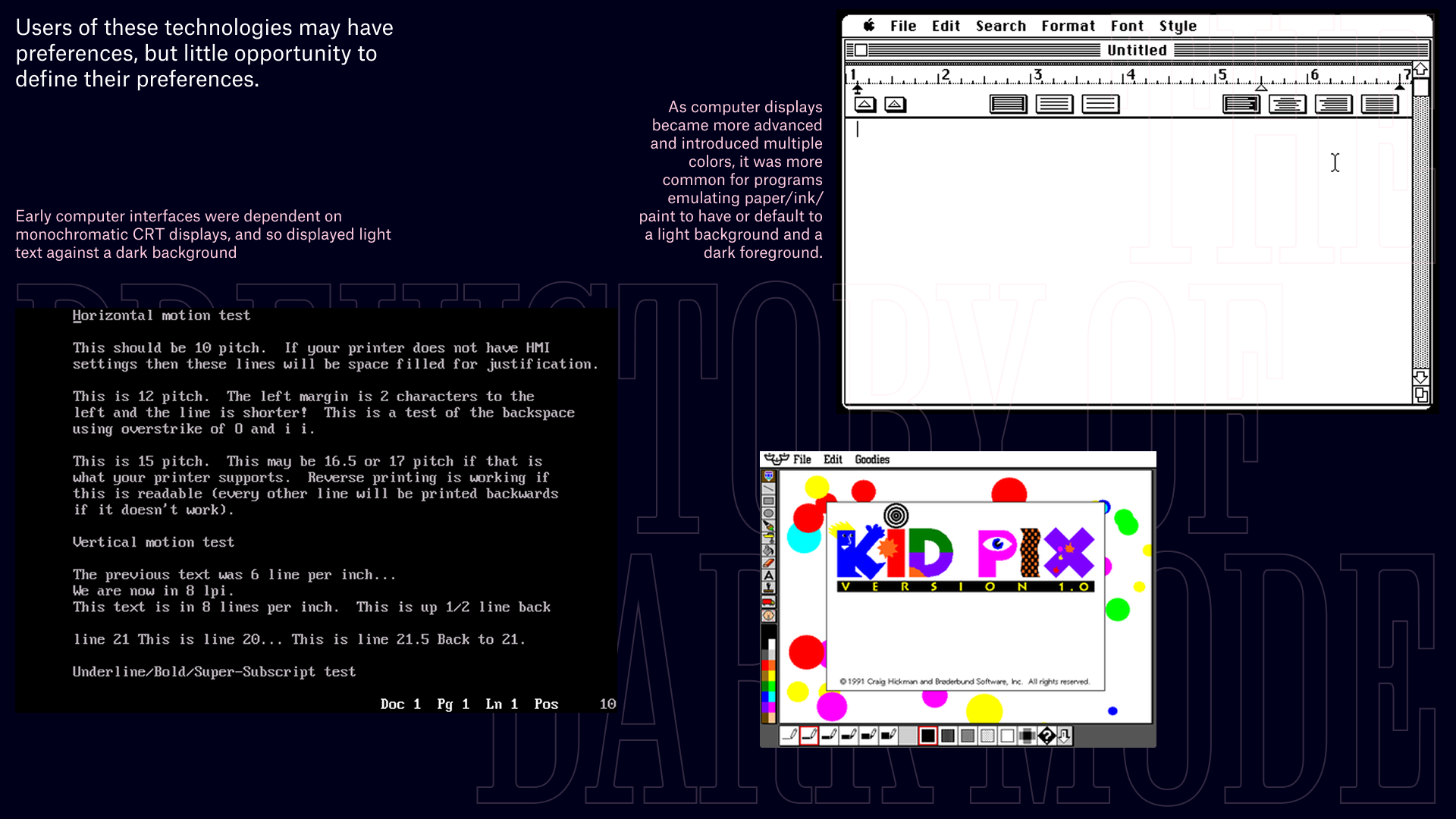
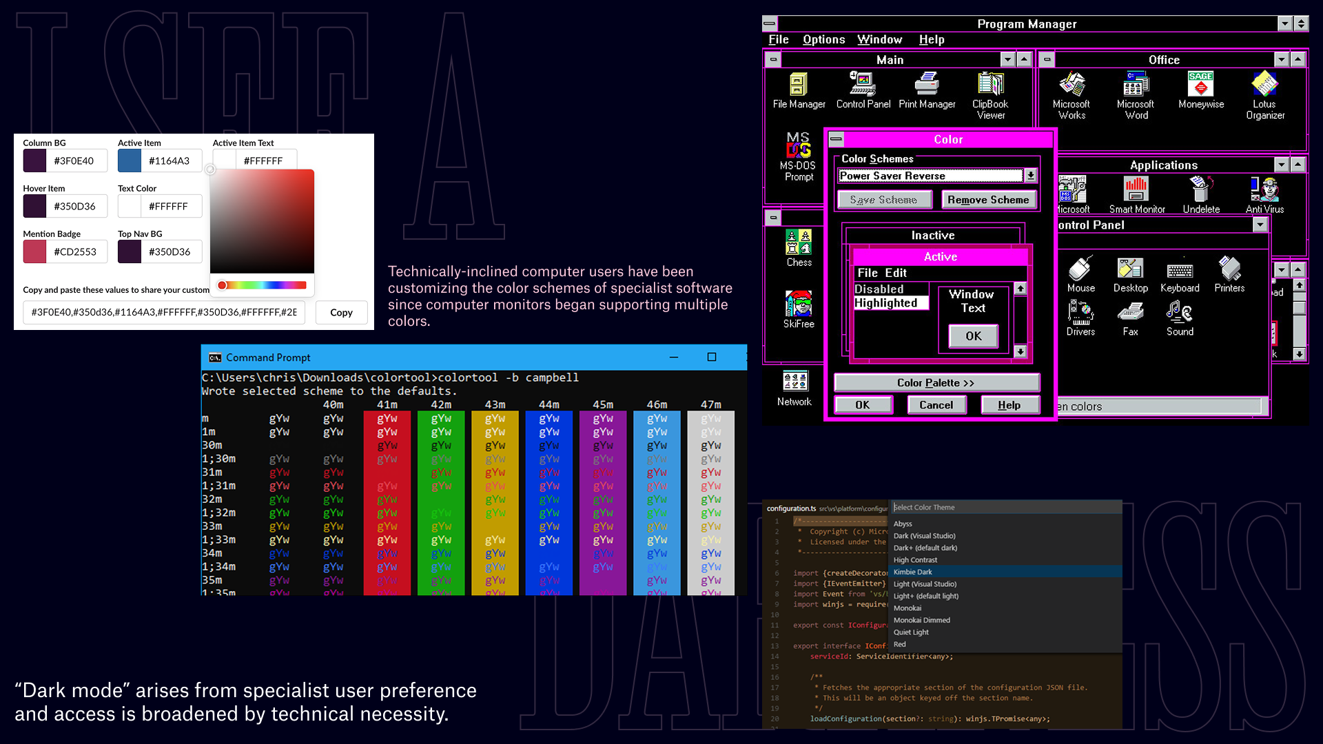
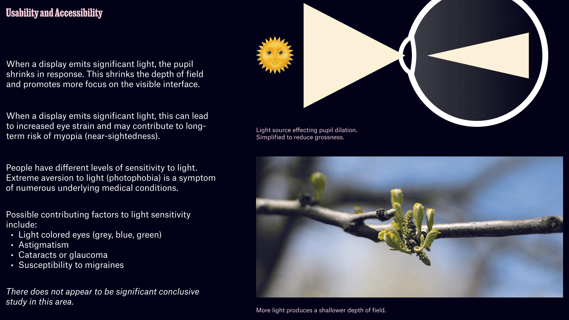
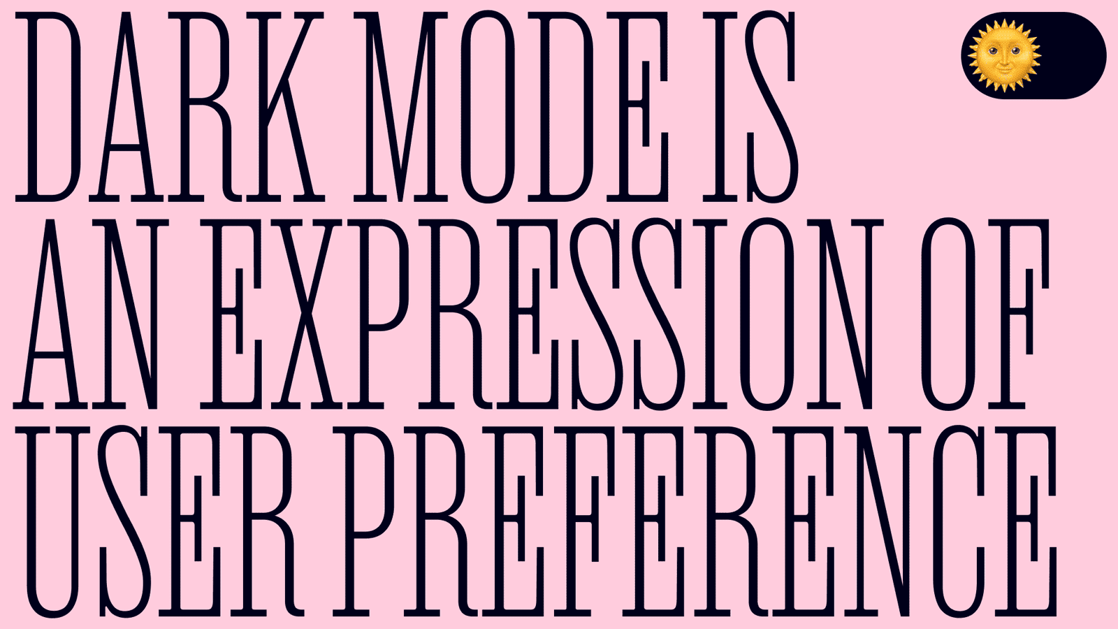
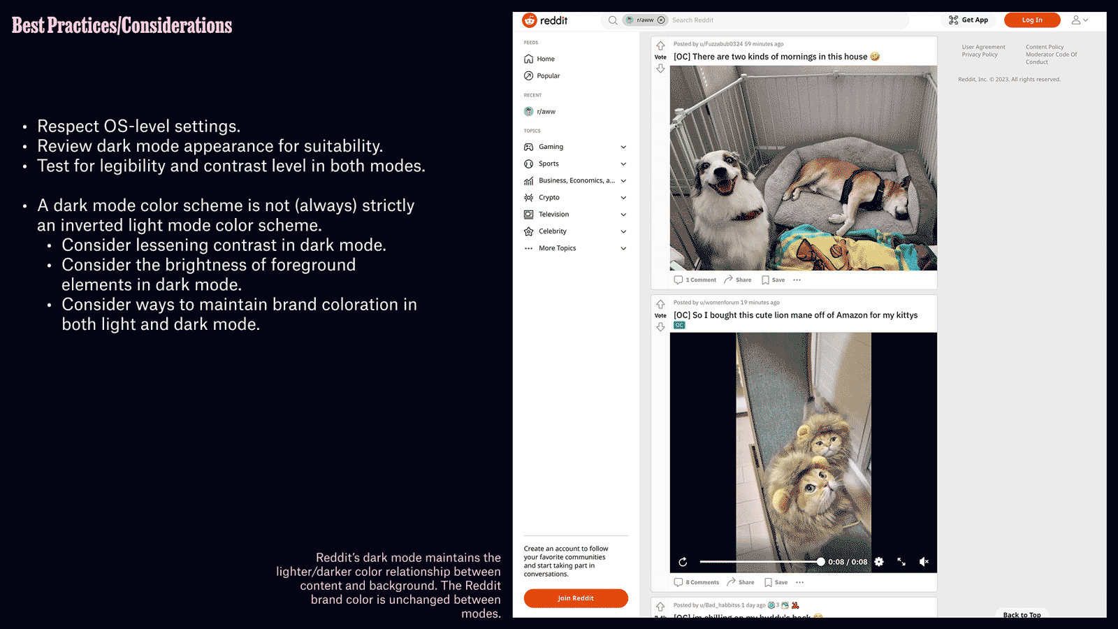
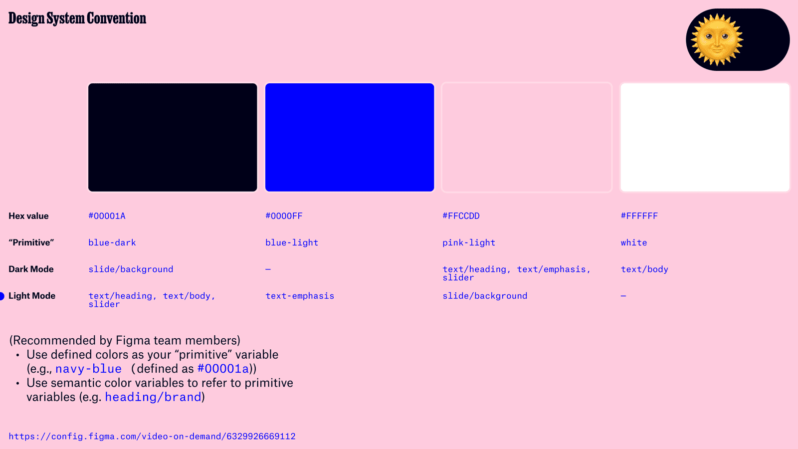
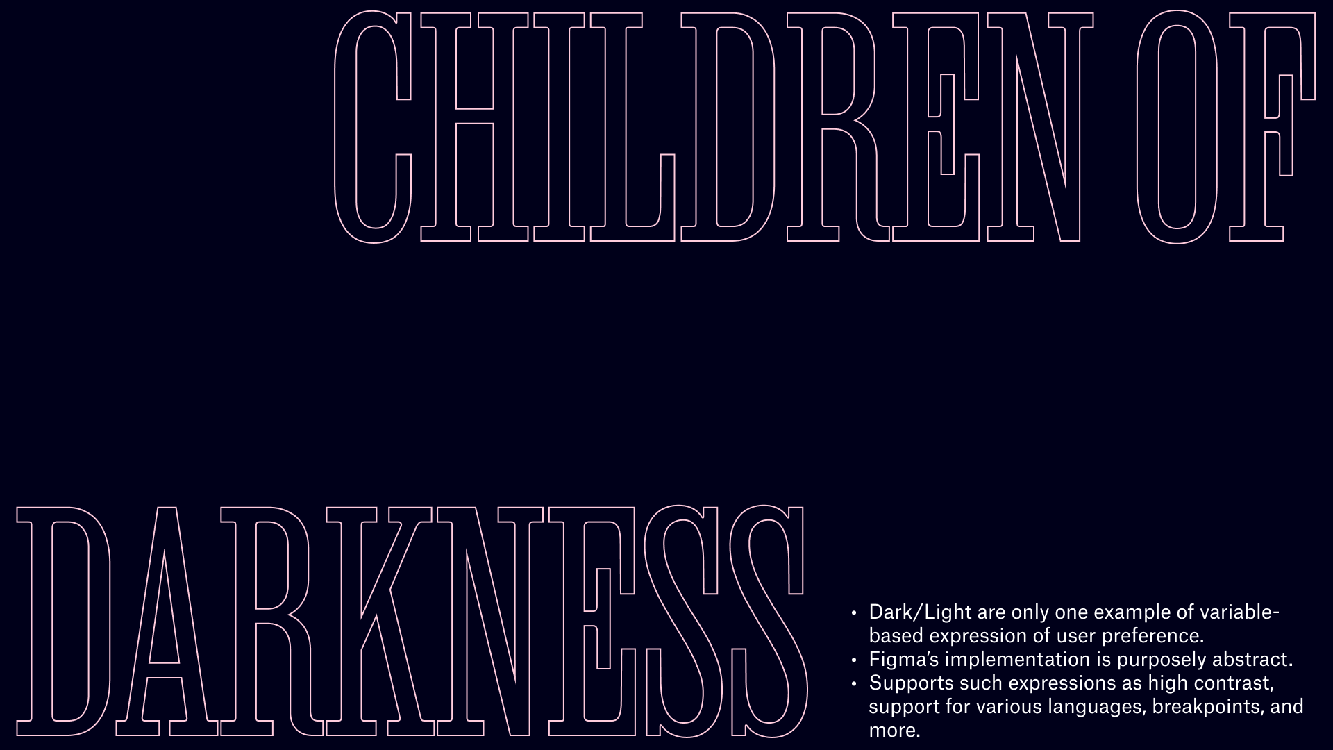
This presentation was also given as part of a series of presentations internal to Reflexions' design team. It was a chance to try out some (at the time) new features in Figma as well as explore "dark mode" as an expression of user preference as well as technical implementation.

Ian Crowther is a design director and designer for product, web, and print.